Could wealth tax become the new monpol?

An idea you’ll likely hate.

Monetary policy is pretty much universally understood to be the only fast and responsive macroeconomic policy lever. I mean, maybe you could make a case for foreign exchange intervention, but it’s considered decidedly gauche among most large developed market economies.

Pre-pandemic, HM Treasury-types looked wistfully at the ability of George W Bush’s administration to send ‘tax rebate’ cheques in the post to stimulate/ rescue households during the Global Financial Crisis. The only fast fiscal instrument at hand was a change in the rate of VAT, which Gordon Brown duly slashed.

But while Sunak’s monster COVID furlough policy proved that in times of absolute crisis there now exists state capacity to deliver monumental fiscal changes without recourse to the semi-annual Treasury cycle, changes in income or corporation tax are painfully slow to implement.

Meanwhile, one of the principal objections to wealth taxes is the difficulty that opponents find in implementation (okay, also the incentives they see in deterring ultra-wealthy folks from living in the UK). So how might wealth taxes feature as a fast macro policy lever?

I’m guessing that pretty much all council tax is paid by direct debit. (Unable to confirm by mere Googling.) Assuming this is true (ahem), we have tax that is levied monthly across households sort-of proportionally to their property wealth. What if policymakers used the rate of council tax to manage the business cycle?

From a household’s perspective this might sound a nightmare: the strength of household purchasing power would become dependent on some macro policymaker’s views as to whether the economy is running too hot or too cold.

Wait – doesn’t this sound a bit like a mortgage? Well yes. Like an old skool mortgage anyway.

It won’t have escaped many people’s notice that the term structure of household balance sheet has changed a lot since the last proper cycle of rate hikes. I wrote about it for FTAV here – noting that the base of mortgaged households has shrunk, and the duration of their liabilities has increased, making them much less sensitive to changes in Bank Rate. The immediate cash-flow hit that households used to experience with a rate hike has been replaced by a long and variable lag. And when the hit does arrive, it can eventually come in size (as, say, a 2% mortgage expires and re-fixes at 6%). My mental picture is a policymaker hitting the bottom of a bottle of ketchup repeatedly to no effect until one last hit sees the entire contents spill out.

Mortgagors are understandably miffed to find, because they are fewer in number and better hedged to changes in Bank Rate, that monetary policymakers need to exact greater pain on them to have the same effect that a smaller move would have in yesteryear. Sarah O’Connor has drawn attention to the intergenerational resentment that this is likely stoking.

If a variable council tax become a macro policy instrument this could spread the load to all property owners rather than simply the shrinking proportion who happen to be debt-financed.

Yes, Council Tax should be reformed with a Zoopla-type algorithm, and probably uncapped. Yes, this new variable tax would likely hurt the price of U.K. residential property. Yes, I know that the cash-flow household channel is but one of many monetary policy transmission channels. Yes, this spit-balling idea neglects any interrogation of unintended consequences.

But the long and variable household cash-flow channel lags would disappear and smaller changes could be made to deliver equal aggregate improvements or deteriorations to household finances.

Told you you’d hate it.

Public services in a digital future

Being honest about the choices we face

This blog is part of a collaborative Joseph Rowntree Foundation project examining and exploring ideas we need to advance Social Justice in a Digital Age.

“Productivity isn’t everything” wrote Paul Krugman, Nobel prize-winning economist in 1990. “But in the long run”, he went on, “it’s almost everything.” Getting more output for each unit of input sounds great. That’s why lifting productivity growth has been a central ambition of every government in the post-war era. More productive economies enable higher living standards, not only in those sectors or firms delivering it, but for everyone.

Some sectors are harder to make more productive than others. To attract and retain workers in these less productive sectors from leaving to join more productive ones, something close to the real wage growth seen in the broader economy needs to be offered to them. In other words, workers in less productive sectors will enjoy real wage gains despite productivity growth being so hard to achieve in their sectors versus others. This was Baumol’s central insight. In this way Baumol might be regarded as the godfather of trickle-down – or at least trickle-across – economics. But, as James Plunkett explains, Baumol either missed or underplayed the ability of institutions and of government to get in the way of his ‘iron law’ holding true.

In the United Kingdom, high-touch human sectors for which productivity gains have been most elusive – social care, childcare, healthcare, education – are concentrated in areas dominated by public provision. This is the result of a political choice: as a society we have decided that there should be some universal floor for human dignity. And while more resource-intense versions of these public services are available through private channels, the universal floor is one that could not be afforded by all if not provided through the public sector.

When we look to the Office of National Statistics’ estimates of productivity growth in the public sector, the results are depressing. Outputs have lagged the rising input costs across the aggregate public sector over the past twenty years, and particularly so in childrens’ social care, adult social care, and education. Is this the dead hand of the state in action? Might putting public services entirely into the private realm deliver productivity improvements that are so desperately needed? Data from the United States does not suggest that this is the case.

Figs 1-2. Labour productivity and hourly compensation in the US nonfarm business sector, and hospital subsector, 1995-2021

Source: Bureau of Labor Statistics, October 2022

The US healthcare system is a hideously complex affair. Treatment is provided by the private sector, with different blends of private insurance and public programmes picking up the tab. It is a system in which strong commercial incentives to innovate and deliver quality care at lower prices are overwhelming, with multi-billion-dollar prizes on offer to those best able to build a better mousetrap. And yet in the highly commercialised and competitive hospital sector, productivity growth has been essentially zero since 1995 (figure 1). The wider private sector has, meanwhile, seen transformative productivity growth. Despite this vast differential in productivity outcomes, hourly compensation in the hospital sector has moved in concert with the wider private economy (figure 2) – just as Baumol would’ve predicted.

Furthermore, we can look to private sector doppelgängers in the United Kingdom like the private school system to see how much value is ascribed to a high touch human sector by those who have means. 

Over recent decades the proportion of children attending private school has remained relatively stable at c7-9%. And the ratio of the top 7-9% versus median post-tax income incomes has fallen rather than risen over the last twenty years. But spending per pupil on private day schools has increased at a far quicker pace than it has in the state sector, with the ratio of spending per pupil in the private sector versus state sector rising despite large real terms increases in state sector spending per pupil.

Fig 3. Comparing the Average Spending per Pupil in English Secondary State Schools to UK Private Day Schools in Constant 2020-21 Money, 1978-2021

Source: Institute for Fiscal Studies, Independent Schools Council, Office for National Statistics, author’s calculations.

Spending per pupil in the State versus private educational realm might provide a sense as to the degree to which our aggregate ability to afford better public services is being suppressed by government’s desire to constrain spending. Other complicating factors may be in play – for example, the degree to which private education consists of its signalling value (like a Prada handbag), or the degree to which the value of elite education is positional (helping to win the CV arms race). But despite these complicating factors we can see that the price paid for secondary education varies meaningfully depending on its limiting factor: the ability and willingness to pay the direct financial costs for private schools of one’s own children versus the collective ability and willingness – mediated by government – to pay for state schooling of other peoples’ children. And where government mediation is absent, an increasing share of income is spent – just as Baumol forecast.

What are the choices faced by society in thinking about how to manage high-touch low-productivity sectors dominated by public provision. There are three, and only three, ways forward – or some blend thereof. These three ways can be thought of as three points of a triangle of possibilities (figure 4). Let’s follow James in making this specific about a sector – social care.

Fig 4. The Triangle of Possibilities

The first choice is to pay more for social care. The proportion of national income going to social care would – taking this path – increase, and each social care worker would be paid more for each hour they worked (as the monetary value of social care increased). This is what Baumol would have predicted. What does this mean in practice? It means higher taxes, a larger state, and it could also open the door to better care. The productivity gains that are delivered in other parts of the economy allow for an overall improvement in our collective standard of living, and that universal floor for human dignity can rise. Realising such ambitions is arguably the point of economic growth.

The second choice is to get less social care – either in quantity or quality. This is what would happen if the buyer of social care is unwilling or unable to meet the rising costs and sets of a reverse auction for care (eg, takes as much social care as can be bought for a fixed amount of money; this might be less and less each year). When ministers stand up and talk about holding budgets flat in real terms, we might be tempted to think that this holds the level of care flat in real terms, but the Baumol effect means that a real terms budget freeze translates into a creeping reduction in services. On the ground this might manifest as shorter and more hurried care visits, with more clients assigned to each carer. It might manifest in the juniorisation of care work – passing work that has required significant training to the untrained or less-trained. It is even possible that such developments are recorded productivity improvements if the tricky judgements required for hedonic calculations mismeasure any juniorisation.

The third choice – although it’s not really a choice – is to work smarter and get more care for the same or less money. It is to build the better mousetrap that has eluded those seeking billion-dollar prizes for doing so in places like the United States with different models of provision. There’s something to be said for this. We shouldn’t get fatalistic about the absence of productivity growth in high-human-touch sectors. Just because these sectors have not yielded great advances before, it doesn’t mean they won’t in the future. Concerted human ingenuity has yielded incredible developments, and the door is open to innovation in the field of public service provision. But we must also prepare ourselves for the choices that arise from a continuation of the trend of the past: flatlining productivity and Baumol’s insights around the requirements to pay more for the same thing, or pay the same and get less in a growing economy.

There is no escape from the triangle. And we currently talk as if there is. So we really need to be more honest.

What story does the data tell about choices that we have made so far for social care in the UK? While never a highly paid sector, the median worker in UK Social Care in the late 1990s was paid a comparable hourly rate to the median non-social care worker. Two decades later this median social care worker earns only around three-quarters of the median worker outside social care (dark blue line, fig 1). This looks to be a direct result of the desire on the part of the government to – on the one hand – guarantee a universal floor for human dignity, but also limit the overall cost to the public purse. As such, the kind of dynamics one would expect from Baumol that we’ve seen in the US hospital sector – bereft of productivity gains – can be seen to have been constrained by the desire of the government to escape the triangle (figures 5-6). But there is no escape. Reducing the relative wage has manifested in juniorisation, recruitment difficulties, and an exodus of care workers into the retail and hospitality sector.

Figs 5-6: Ratio of hourly gross pay for UK Social Workers without Accommodation versus All UK Workers (Medians and Means); Hourly wages for workers in the US hospital sector, US private sector, UK social work sector, UK all employees 1997-2021 (1997=100)

Source: Bureau of Labor Statistics, Office for National Statistics, Authors Calculations October 2022

The bottom right corner of the triangle – higher productivity – which is so compelling because it avoids some really dramatic and unpleasant choices, looks so far to be based in fantasy. An hour of childcare/ eldercare today is comparable to an hour in 1870.

And so the big choices put us back at the opposite edge of the triangle. On this edge of the triangle there is a straight trade-off between a larger state that harnesses our aggregate economic productivity gains to maintain or lift the universal floor for human dignity on the one hand, and sequential reductions in quality and quality on the other. Whichever choice we make should be made in the open.

What would it really mean to succeed here and occupy the high productivity corner? Dystopian fantasies in which children and elders are plugged into VR headsets where they can be entertained, educated and stimulated in the metaverse, while robots operate in the physical realm to support their bodily functions or restrain them can surely be discounted. Increasing the number of children a childminder can legally look after each year would only deliver a deterioration in quality masquerading as higher productivity (ie, the bottom left corner). It would require a more granular view of things like work organisation, job design, market structure, business models; all considered for different geographies and sub-markets.

More efficiency is – and should be – a real goal, but retaining the centrality of human touch in these sectors poses limits to productivity gains that can be achieved.

Liability Driven Investment (LDI*) – quick explainer

I wrote a quick blog for FT Alphaville earlier about some of the frankly incredible moves that have been happening at the long end of the yield curve earlier today. I’m worried that it’s a bit too impenetrable to non-bond-geeks. So this is my attempt at a public service explainer. It’s still pretty bond-geeky, so you’re not being stupid if you don’t follow. You’re being human.

Imagine I’m a scheme with £100 of assets and £100 of liabilities.

I put £20 into ‘matching assets’ – say, long gilts.

I put the remaining £80 into low-volatility growth assets that might beat cash like short-dated bonds, private credit, diversified growth funds and equities.

The value of my liabilities are estimated by discounting them back to ‘present value’ using long-dated bond yields. Given my asset allocation of 80:20, I have a big asset-liability mismatch. Every time long-dated bond yields fall, the present value of my liabilities rise – but only a portion of my assets rise in value. While my assets are not affected hugely by changes in bond prices/ yields, my liability value is: I have a big mismatch that leaves my pension deficit subject to the whims of the bond market.

To hedge against this risk that bond yields move, I enter into an interest rate swap, receiving fixed for 20yrs and paying floating on £80.

Now my assets and liabilities are duration-matched. I no longer care whether bond yields go up or down: my funding ratio is hedged. If bond yields go down a lot it will inflate the present value of my liabilities and also my matching assets (the £20 of gilts) and my interest rate swap overlay (the £80 notional).

What security does my swap counterparty have against me going bust and not being good for paying floating/ receiving fixed over the next 20 years? I need to post some high quality collateral. Luckily I have £20 in long-dated gilts! This is more than enough, and more than I am ever likely to need. Most of this will count as ‘excess collateral’.

If yields rise, this eats into my ‘excess collateral’ (as more collateral is required by my counterparty). I might need to sell down some of my growth assets to replenish it.

This happens all the time. It’s no big deal. Sometimes rebalancing favours purchases of growth assets, sometimes it favours sales.

Rebalancing might happen daily, but more often it’s a monthly or quarterly affair.

What happens if there is a very sharp move in yields intra-month? Conservative risk management on the part of LDI-managers ensures that schemes are protected against these moves by conservative over-collateralisation, the levels of which are derived from rigorous stress-tests.

What happens if the move is so huge that your stress-tests are busted? You probably need to get scheme sponsors to sign-off with wet ink that you can do large asset sales in other areas (maybe liquidating assets held by other managers), or get them to stump up new cash.

What happens if you can’t get the logistics to work (maybe because assets are tied up in private credit, other illiquid stuff, maybe because you just can’t chase down signatories)?

You, the pension scheme, will have defaulted. Under the terms of your ISDA, your counterparty is likely to liquidate your collateral and close out your 20yr swap position. (I honestly don’t know what happens legally after this, but defaulting on financial contracts is not great.)

Where does this leave you? You are now unhedged against rate moves.

This may be great for your funding ratio (if yields soar, albeit this could trigger waves of others to be cleared out of their swap positions).

This may be a funding rate disaster if yields collapse.

I feel very very sorry for any pension fund that has just been whipsawed – losing their hedge at the intraday yield peak only to find yields 100bps lower. This would be their true disaster scenario.

Lastly, I want to give a HUGE thank you to the wonderful and brilliant Dame Kate Barker. It was actually her who set me off looking at LDI and potential systemic risks attached back in June. Always listen to Kate!!

* This is not about what John Ralfe would call LDI.  It’s with what John Ralfe would call ‘levered LDI’. Universally otherwise known as LDI.

A quick blog on Pix

Banco Central do Brasil launched an instant state-backed retail payment system back in November 2020 called Pix. You might know all about it already. If not you should.

Why? Pix is a powerful case of the state innovating to benefit its population, disrupting the rents collected by financial institutions & big tech.

What problem was Pix trying to solve?

Firstly, payment systems are expensive. McKinsey reckon that in 2019 payments revenues doubled over the last decade to around $2 trillion in 2019 – 2.6% of the GDP of countries covered by their work (and rising)! Running a payment system is super-profitable. To take Visa and Mastercard as examples, profit margins are comfortably north of 40%.

But that’s how capitalism is supposed to work right? Smart people get together to form banks, or firms like Paypal, Visa, Square etc, innovate better products that make our lives easier/ nicer/ more productive and get super-profits in return. Yes!

These super-profits are supposed to be competed away as they attract new competitors. The market is supposed to solve these problems, not the state! However, there has been little sign that these super-high margins are getting squashed. Network effects attached to payment systems can represent huge competitive moats!

As a non-profit state-backed retail payment system, Pix is much much much cheaper. Take a look at the chart below from the Bank of International Settlements’ recent report:


Second, payments systems can be slow. And this can be a problem for small firms. Nowadays, when I buy a sandwich with my debit card my phone buzzes to tell me the money has left my account. But it may not reach the vendor for days. So small firms will see themselves as essentially financing banks and others in the payment system. Pix delivers final settlement in seconds.

How successful has it been? Hugely. Pix has become the number one payment means by transaction volume, used by 114m people – 67% of the adult population – having been launched only in November 2020.

Okay, but why should you care?

The state is generally seen as good at funding a lot of the basic science, and even some quite advanced bits and pieces (like, er, the internet) that private sector firms then commercialise. But we tend to rely on market forces to eat away rents. Rents can prove very sticky. Pix offers an example of the state innovating, bringing to market what appears to be a superior product to its population, and in so doing leaning hard against these sticky rents.

But that’s just Brazil, right?

There’s an awful lot of work going on to bring the possibility of Central Bank Digital Currencies (CBDCs) into existence across the world. The BIS survey of central banks in 2021 found that around 85% of central banks were engaged in work on CBDCs. Pix is not a CBDC. But it does offer a glimpse into the way in which a retail CBDC might be successfully introduced, and the sort of impact low-cost digital state money could have on the payments market.

Crypto, Art, Stocks and Power in 2021

My day job is to lead a team of people who analyse and invest in financial market assets on behalf of clients. It’s mostly stocks and bonds.

Portfolio managers tend to seek to identify assets that will command higher prices some time in the future and/or deliver a predictable set of future cash flows. We talk about ‘valuation’ in the strictly financial sense quite a lot. Keynes, writing about financial valuation, likened it to a contest in which to win, contestants needed to guess which photo most other contestants would identify as the most beautiful (rather than applying their own individual tastes). I think this is right, but sort of brushes over the epistemological nature of the contest as lived.

Portfolio managers focus of earnings, inflation, non-farm payrolls, Fibonacci retracements, or whatever else that rocks their boat when assessing financial value. In so doing, they are asserting some internal model as to how the world should think about valuing assets.

Every time the internal model works (eg, stock jumps when earnings surge/ beat) another little positive reinforcement loop is completed. Confidence rises that the internal model as to how portfolio managers think things should be is a close approximation to how things are.

But every now and then a thing comes along to remind us how all financial valuations actually work. This year three things came along: NFTs, cryptocurrencies, and meme stocks.

I have zero professional experience of the art market. Beeple’s mega-Christies sale got the world’s attention. It brought attention not only to digital art but also NFT’s more generally and got folks asking how such valuations might be possible. For me this question carries an easy (if perhaps banal) answer.

The price paid, like that of any artwork, indicated not its extraordinary artistic worth but rather that (usually) at least two people of substantial financial means reckoned that the art in question is worth more to them individually than some chunk of their financial wealth. Art’s financial value is plutocratically determined. One person thinks a painting is worth $1m? Nada. Two people with plenty of financial muscle think it’s worth $1m? It’s worth $1m.

Is the easy answer to NFT/ fine art valuation an easy answer to cryptocurrency valuation? I think so.

Bitcoin/ Dogecoin/ etc have been around for a while. But 2021 saw their collective financial value boom to around c$2.4tn. I don’t encounter people getting mad that a Duchamp Readymade might be inappropriately valued in the context of it’s likely future cash flows: we all know its future cash flows don’t exist.1 But plenty are enraged by substantial financial valuation being attached to either crypto in general or a particular piece of contemporary art.2 And I think people get cross for largely similar reasons.3

While folks scratch around to try to consider valuation frameworks for cryptocurrencies along the lines used to value currencies or commodities, I am more persuaded that the appropriate valuation framework to apply to them is – like NFTs – that of contemporary art.

What about Meme stock valuations? Just like art and crypto their valuations too are also plutocratically determined. The performance of stocks like GameStop and AMC generated the same challenges to the financial world’s established epistemology of financial value as those posed by crypto. The reason why it felt different was that it was done on home turf.

In asset management the idea of active management in a state of market inefficiency is based on the notion that by scraping together good insights, information and analysis it is possible to generate super-normal risk-adjusted returns. I buy into this in a big way. But it is predicated on the notion that others are employing broadly the same mental model around what should command financial value. After all, if you’re looking for super-normal risk-adjusted returns, there’s no point (as a small investor in public markets) identifying awesome firms that will deliver strong and above consensus results if they are going to be subject to a multi-year or multi-decade valuation death spiral (because no-one else reckons that strong and above consensus earnings should translate into higher financial value). Firms that satisfy the model tend to be ascribed a higher financial valuation, while those that don’t may find themselves less able to attract financing upon which their business may depend.

For all the hate out there amongst conventional folk for Chamath Palihapitiya – sometimes characterised as a mega-rich tech bro with political ambitions, punting what is for him spare change into the GME trade in a bid to buy a constituency – I thought that this interview with him by CNBC’s Scott Wapner addressed the issue more clearly than I have seen elsewhere (emphasis mine):

Palihapitiya: …the fact that they shouldn’t be allowed to exist because all of a sudden like because we decide that they should be obliterated into the ground

Wapner: No, they should be allowed to exist. They should be allowed to exist at whatever price their stock should be value at based on what their earnings are and this stock was like seventeen eighteen dollars not that long ago.

Palihapitiya: Who says that? Who says that? Do you want to make the same argument about Tesla? It’s gone 10x in a few months. You don’t know what it’s worth – let’s be honest okay?

Wapner: You don’t think that Tesla’s growth prospects…?

Palihapitiya: Scott – I have my own model for the company. I’m allowed to underwrite however I want to own it. Everybody who bought that stock is also underwriting how they want to own it. And the point is – just because you’re wrong, doesn’t mean you get to change the rules. Especially when when you were wrong you got bailed out the last time. That’s not fair.

The conventional philosophy of security valuation informs a lot of real world decisions as to how resources are allocated. In demonstrating that the financial valuations of firms (just like cryptocurrencies and contemporary art) are plutocratically determined, the Redditters reminded us that those with financial power get to determine financial value.

The strong relationship between financial valuations and fundamentals exist only to the extent that fundamentalists are the ones holding financial power.


1 I mean, sure you could put together a business plan to acquire a top notch art collection, build a private museum, employ staff, charge entry, and make oodles of money. But I’m unconvinced that such plans underpin the art market.

2 It’s not just the financial valuation that gets people cross of course. People also get cross about the facilitation of criminality that is perceived to be engendered, scope for mis-selling they pose to the unsuspecting given an almost total absence of regulation, and jaw-dropping environmental damage attached to proof of work. Labelling these as differences will likely be contested.

3. I think that the reasons that people get cross about the financial value attached to contemporary art falls into five broad categories:

  • Resource allocation: when people who have the resources to drop millions on art do so rather than something else (eg, solving world hunger);
  • FOMO: when people pay large for someone else’s art, and completely overlook their own artwork (category reserved for artists, although also maybe also dealers and collectors who don’t own the stuff commanding the sky high prices);
  • My money! When public money is spent on something that someone doesn’t like (Carl Andre’s Equivalent VIII – ‘those bricks in the Tate’ – is still probably the most famous example);
  • Culture Wars: owing to the exclusionary and condescending culture that grows up in the industry that springs from these high prices.
  • Money & Value ontology: when monetary value – which so often is deployed as a proxy for actual value – has been assigned to something that someone sees as valueless (and this proxying is, to be fair, the conceit which underpins the allocation of scarce resources in a market economy).

It appears to me that these are analogous to the reasons people get cross about crypto asset financial valuations.

Voter suppression in the UK?

The Guardian scoop today on photo ID requirement in UK elections references a @commonslibrary report estimates that 3.5m UK adults lack photo ID required to vote.

In the US, the Republican Party has been accused of playing this move to exclude Black voters from voting, and the accusation looks pretty compelling.

My gut reaction, like those trending across Twitter, was that the move to require photo IDs to vote in the UK is the Conservative Party’s version of voter-suppression.

That gut reaction might well be right, but it doesn’t look like it is supported by ONS Census data.

There appear to be three dimensions of exclusion/ suppression that are trending: age, ethnicity, and wealth.

First, age. It’s not immediately clear to me whether the mechanism for youth voter-suppression is thought to be the additional friction involved in the voting process, or because it is assumed the young have lower access to photo ID.

Young people are not very good at voting today, so I can see that adding additional hurdles might be reasonably likely to worsen youth turnout further.

Second, ethnicity. This tweet from @jasebyjason was matched by many other good tweeps

The stat looks to be sourced from this @electoralreform story saying 48% of Black people don’t hold a full driving license.

Third, wealth. Passports in the UK are expensive things, and it seems reasonable to guess that passport ownership might be proportionate to wealth.

There’s also the direct partisan skew about which @jburnmurdoch and @chrishanretty have done research (which is quite striking!!)

What can we say about the evidence behind this gut reactions from some quick Googling and pivot-tabling?

Well, the @ONS does a Census every ten years, the last for which data is available back in 2011. The 2011 Census includes a question about holding a passport – separate from nationality. I looked to see whether there was immediate data that would answer how ownership split by 1) age; 2) ethnicity, and 3) wealth, expecting that voter suppression of the young, non-white and poor to show up.

Someone put in a request for answers to this to be broken down regionally by age, sex and ethnicity back in 2016. Wealth data isn’t available, although someone smart with time on their hands could probably do something clever with regional incomes and infer it from the regional split. The data is found here.

The data did not match my priors.

I might’ve made a mistake somewhere, so please correct, but the following things can be drawn from the data:

  • Of c.65.5m people in the UK, 74% are adults with British, Irish or Commonwealth nationalities who I infer are eligible to vote in UK elections. The remaining 26% splits into minors (22%) and non-eligible adults (4%).
  • Of these 74% eligible voters, a full 15% don’t have passports (ie, 9% of the population are adults without passports, 64% are adults with passports). This is not to say that they might not have driving licenses or other photo ID.

How does the age break-down of passport holdings break down? It looks like the old are the ones who are under-represented. Close to 20% of those aged 60 or over lacked a passport compared to less than 10% of 18-40yr olds:

How did the ethnicity of those lacking passports break down? It looks from the data like those self-identifying as white are under-represented as passport holders.

How about the intersection of age and ethnicity? It looks like younger non-white adults have a higher likelihood of not having a passport than older non-white adults. You can’t really tell from the chart, but just under 4.5% of non-white adults under the age of 30 lacked a passport, while the proportion according to the ONS is around 2.5% for the over 50s.

What does this all mean?

  • Does this make requiring photo IDs good? No.
  • Does this mean that requiring photo IDs will not deliver a partisan skew to voting? No.
  • Does it mean that the proposal isn’t a cynical attempt to gerrymander demographically? No.

All this means is that if someone designed a requirement to have photo ID to vote based on the understanding that it would exclude younger and less white adults, this understanding does not appear to be aligned with the ONS Census passport data question.

Or the data is wrong.

Bitcoin’s energy debate (and the Nature of Money)

Joe Weisenthal‘s morning notes are always worth a read. This morning he touched on a topic that I’ve been thinking on for a few days – the arguments around Bitcoin’s electricity usage.

The electricity consumed by the Bitcoin network is a bit more than Pakistan’s – a country of >200m people. Is this worth it? I went down this rabbit hole after tweeting this out a few weeks back:

You can browse the replies at your leisure but you can see that there was not a lot of love from the Crypto Bros. I tend to use Twitter as a learning resource, and in between the abuse I got some nice links to counter-arguments. They took me back to my old favourite subject: the nature of money.

Money is the medium that makes otherwise incongruent things comparable from a market perspective.

We all attach our own and different subjective values to different marketable things, but a marketable thing’s monetary value represents the crystalized triangulation of all of our subjective values (weighted by our individual monetary means). Simmel wrote a lot about this, basically outlining money’s role as reifying societal value.

So while the subjective value/ utility that I ascribe personally to a Bitcoin might be lower than that to which I ascribe a glass of clean drinking water, the money-weighted triangulation of subjective values/ utility ascribed to a Bitcoin is much much higher at around $46k.

Mark Carney outlined in his recent Reith Lectures that this money-centred value theory is actually somewhat new. In the late nineteenth century and early twentieth century, a group of economists known as neo-classicists launched an upheaval in value theory – comparable to the Copernican revolution in science. For older theoreticians like Smith, Ricardo and Marx, markets determine the distribution of value which was derived from labour. According to the neo-classicists, labour doesn’t give a good its value; instead, labour is valued because it is an input to a good onto which people project value. We can see how much value they project onto a good or service in its price (which serves as a money-weighted triangulation of subjective value). As such, price became the best description of value. Or, too take this to the extreme, Price = Value.

Going down this line of argument, the resources are consumed in delivering Bitcoin Proof of Work have been bid away from other projects because PoW has a higher value attached to it than any other activity. And as such it is idiocy to focus on electricity used by that which the market has determined to be the highest value activity.

Another line of defence in the energy use of Bitcoiners is that electricity isn’t fungible, and so Bitcoin mininng effectively utilises stranded or unreliable generation assets and turns them into something considered useful by many rich people (ie, Bitcoin). Some advocates sometimes go on to say that Bitcoin mining arbitrages electricity costs, although I think that this pushes the argument too far because energy that is ‘stored’ in Bitcoin form cannot later be released. A rehearsal of such arguments can be found in this popular blogpost.

I do see an integrity in these lines of argument. If we take the [price = value] route in judging the value of a thing to society, singling out Bitcoin’s environmental costs over the environmental costs of other things is nonsense.

Crypto Bros use a lot of electricity mining/ transacting in Bitcoin and ascribe positive subjective value to this activity even though I see this as pointless pollution with a large environmental cost.

I use electricity in connecting to the internet; I ascribe positive subjective value to this activity, but some readers of this blog might see it as pointless pollution. To one another we each say:

But I am unconvinced by the argument. I am unconvinced because I can see that such arguments would work to justify the generation of any form or level of pollution if activity of polluting delivers a monetary value. And I don’t feel comfortable signing off on that.

Maybe it’s a question about capturing the cost of the negative externalities attached to pollution properly – that would be the economist’s take, and one that I imagine Crypto folk might be happy with (although would maybe require inter-governmental alignment and enforcement that is antithetical to the Crypto crowd).

Maybe it’s just a recognition on my part that while markets and money are and have been – in my view – kind of amazing, they will always be incomplete and a poor clearing house for questions of axiological ethics. Which is a bit of a problem if they are used as such.

Money, Tax and The Left

Jo Michell has written a good piece in Tribune countering arguments from some on the Left around the necessity of taxation.

It’s a short piece that you should read, but I understood it as going a bit like this:

  • Case 1: If there is lots of economic slack in an economy (think loads of folks unemployed sitting at home wasting their skills and producing nothing), government can spend newly printed cash to boost the economy and there are frankly few immediate downside consequences.
  • Case 2: If there is not much economic slack (eg everyone has a job), printing loads of cash to spend on new projects will mean bidding folks away from their private sector jobs (which were presumably economically productive and need to be filled) and also puts more cash into the system than is wanted, so those with cash balances play a game of hot potato (trying to rid themselves of cash balances and transferring them to one another in exchange for goods, services, financial assets like shares, real assets like houses, or indeed foreign currencies – resulting in higher prices for some or all of these).
  • The problems in Case 2 can be addressed with taxation. This reduces aggregate cash balances and “the wasteful consumption of the wealthy” to make resources available for “socially-useful spending”. And actually, taxation can be deployed in Case 1 too.

Jo’s beef looks to be with the MMT crowd, who I think he reckons have dragged elements within The Left away from understanding taxes as useful (given that the magic money tree really does exist). Jo was pretty careful not to go all inflationista in his piece, but it’s plenty obvious that monetary stability – or what Keynes referred to as confidence in the currency – is at the heart of his argument.

But I do wonder whether some folks on the Left may have taken to MMT either because:

  1. they have different views around the strength of institutions in the political economy (eg, print now and we’ll have no trouble whacking taxes and/ or interest rates up at a later date if we need to). I have my doubts. Or;
  2. they see lower confidence in the currency as a *desirable outcome*.

There are lots (and lots) of problems with capitalism as an organising system, but I would not describe myself as anti-capitalist and as such see a reduction in confidence in money as an undesirable outcome.* If I were an anti-capitalist Leftist then Keynes’ famous argument (citing Lenin) that the best way to destroy the Capitalist System is to debauch the currency makes debauching the currency sound pretty interesting!

I’d always understood this Keynes/ Lenin argument to be that you need money to make capitalism function, and so destroying money as a store of value, unit of account, and ultimately as a medium of exchange through hyperinflation collapses the economic system. Pretty straightforward. If this is what attracts some on the Left to MMT I don’t think Jo’s arguments for creative use of the taxation system will shift them.

But it was interesting today to read chapter 6 of The Economic Consequences of The Peace from which Keynes/ Lenin’s phrase is taken. I’m now less sure that my straightforward understanding of Keynes/ Lenin’s argument was right.

Keynes elaborates that inflation destroysI Capitalism by:

I find this fascinating. These are four points that I would recognise as being pretty zeitgeisty, although not points I would have immediately associated with inflation. I don’t know whether they really are the Four Horsemen for the Capitalist system, but they seem to be gaining ground despite the absence of inflation.

With regard to the use of the tax system, I’m with Jo here, and have been for some time. Monetary financing needn’t spell disaster and may indeed be required to prevent deflationary spirals. But tax serves a purpose – in fact many. What sort of taxes should the Left focus on? Wealth taxes!

=======

* I reckon that many/ most of the problems associated with capitalism can be offset or corrected by a liberal democratic State designing and revising a rules-based framework, with discretion to compensate for inequitable outcomes and the power to offset market failures of many descriptions. This makes me, I think, a social democrat. This may be naive, but I would prefer to channel energy into improving the rules/ governance rather than dismantling the construct.

A Better Fiscal Rule

Neville Hill and I originally wrote this piece in early summer 2019, but never quite finished it. As all the excitement over fiscal rules ahead of the 2019 UK General Election kicked-off, we wrote up a précis which was published by FT Alphaville.

We then submitted a longer version to the Society of Business Economists’ annual Rybzynski Prize and were delighted to be shortlisted. Since then we have received a number of requests for the longer version. Here it is:

——————

Fiscal rules have never been so prevalent among nations, but most fiscal rules fall victim to charges of ineffectiveness, over-complexity, asymmetry and harmful pro-cyclicality. The succession of fiscal rules – national and supranational – to which the United Kingdom has made itself subject since 1992 are no exception. We argue for a new fiscal rule that might help secure fiscal credibility that is intuitive, counter-cyclical and potentially symmetrical.

Today the United Kingdom targets a falling debt stock as a percentage of GDP and a cyclically-adjusted budgetary balance over the medium-term. Eurozone member states are subject to a plethora of deficit constraints and an obligation to reduce the debt stock to 60% of GDP.

Most of these rules are being met. But these rules are no longer fit for purpose in a world where policy rates are low and central banks have little room to ease.

Why a fiscal rule?

The economic, political and social consequences of each of debt default and high inflation are severe.[1] And there appears to be a limit to the proportion of total economic output that can be directed by a government towards public debt service, bounded by political, social and financial market parameters.[2] Furthermore, while monetary sovereigns can always summon into existence more money to service debt, there are good reasons why they might not always want to.[3] As such there is a powerful imperative towards limiting or reducing debt on the part of governments seeking to maximise long-term fiscal flexibility.

But while long term fiscal sustainability is a goal upon which every government can agree, the short-term incentives to increase spending can prove politically irresistible.[4]

Fiscal rules are means by which governments can seek to bind themselves (and demonstrate to others that they are bound) to the masts of fiscal rectitude. And while mixed, the evidence suggests that episodes of significant debt reduction have been associated with the introduction and use of fiscal rules across a number of countries over many decades.[5]

Fiscal rules fall into one of four categories – budget balance rules (maximum deficit), debt rules (creating upper limits on government debt), expenditure rules (limiting growth of expenditure) and revenue rules (generally targeting revenue as a percentage of GDP). [6] Each of these approaches have sought to secure debt and, consequently, monetary sustainability. Debt rules go directly to target an upper bound for government debt stock, while the others provide intermediate targets that will restrain or reduce the level of government debt. The rules are all asymmetric – they instruct governments to cut deficits or debts, but do not set a lower bound, or instruct more expansionary policy. That may reflect the fact that they were largely designed in the wake of the fiscal and monetary policy failures of the 1960s-1980s, when there was a compelling need to demonstrate fiscal and monetary credibility.[7]

What’s the problem?

Existing fiscal frameworks recognise the prospective dangers attached to a high and spiralling stock of debt, but are not designed to see the dangers of inappropriate deleveraging. Pro-cyclical fiscal tightening (raising taxes and cutting government spending in the midst of a slowdown or recession) can be especially damaging to the economy,[8] and the rules described above, targeting maximum debt stocks or government deficits, are prone to signal the necessity of fiscal tightening at precisely the moment of maximum pain.[9] Critically, they assume that monetary policy will be free to administer short-term demand management and so may be mis-specified when rates are at or near the lower bound.[10]

And they willfully ignore information embedded in financial market prices, seeing markets only as prospective constraints to fiscal flexibility: a capricious and constant source of risk. This, as we discuss below, presents another source of asymmetry: governments cannot ignore the message of very high borrowing rates, no matter what their fiscal rules are.

Simply put, while any fiscal rule will be clunky, the existing rule set poses meaningful problems and dangers when policy rates are at or close to the lower bound, as they have been for the past decade.

A better fiscal rule

A key aim of fiscal rules is “sustainability”: to ensure public finances are managed to avoid the risk of default or inflation. And although the size of a government’s debt obviously has implications for sustainability, it is not the only metric that matters. Nor is it the most important.

Sustainability is the economic and political capacity of the state to meet its financial obligations. We think debt interest service as a percentage of GDP is a better metric than debt stock when it comes to capturing the concept of sustainability. When debt service is very high, governments find it challenging to dedicate tax revenues to paying coupons on bonds. But conversely, when it is low it would suggest there is room for fiscal expansion.

Debt service is a product not of stock alone, but of the size, tenure and type of existing debt stock, the growth in economic output, primary fiscal balance, choice of new issuance, and the level of market interest rates. These factors, furthermore, are interdependent.[11] In summary, debt service is a function of the past fiscal legacy that must be managed, the present economic environment that is ever-changing, and external expectations as to future economic and monetary conditions. Furthermore, it responds to changes in its determinants fairly slowly, especially if the debt and issuance tenure is long (see Appendix). That means fiscal rules based on debt service targets will generally only necessitate gradual changes in fiscal policy, not abrupt dislocative shifts.

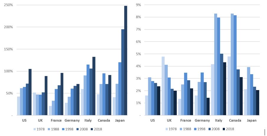
Debt stock and debt service then are related, but distinct. They can move in opposite directions for decades as a glance at recent United Kingdom budgetary history can show. In 1980 the United Kingdom spent 5.2% of GDP towards servicing government debt; debt to GDP stood at 46.2%. Fast forward almost forty years and we can see debt service as a percentage of GDP having fallen to 2.7% of GDP (2.0% of GDP after the fiscal impact of QE is taken into account), while debt to GDP had almost doubled at 89% of GDP. This startling fall in debt stocks and interest costs moreover is not unique to the United Kingdom (see Figures 1 and 2).

Figures 1 & 2: Debt stocks as % of GDP since 1978; Interest costs as % of GDP since 1978

Fig 1-2

Instances where interest costs have reached 5% of GDP have tended to be met by alarm in Finance Ministries, and fiscal adjustment programmes have tended to follow (Canada’s 1985 and 1995 Plans, Italy 1988 and 1995 Plans, the UK’s 1976 IMF programme and 1980 Medium-Term Financial Strategy).[12]

There have been multiple other instances where fiscal adjustments have been delivered by G7 governments – most recently the UK’s 2012-2020 programme of austerity that seeks to target debt stock. But as Blanchard and Tashiro (2019) argue in relation to Japan – where debt-to-GDP is more than 2.5X higher that seen in the UK and debt service is 30% lower than the UK as a percentage of respective GDP – the appropriate fiscal policy for the Ministry of Finance may well be an increase rather than a reduction in primary deficits over coming years, given the macroeconomic challenges of re-anchoring inflation expectations in firmly positive territory and delivering higher levels of economic growth while the Bank of Japan remains at the effective lower bound. A higher debt stock is not a desirable end in itself, but nor is it necessarily a greater danger than an inappropriately tight fiscal policy when debt service is low.

The reason for this fall in debt costs despite the surge in debt was the collapse of market interest rates. In 1980 long term Gilt yields stood at 13.9%, and by 2017 they had fallen to 1.0% This decline in market interest rates reflects changing market expectations of economic growth and inflation. But the fall in market interest rates from a fiscal policy perspective appears to have been taken as an event rather than as a signal. A government’s decision to ignore the information embedded in asset market prices short-circuits the ability of easy monetary conditions to prompt economically stimulative fiscal policy; refocusing fiscal rules towards debt service would remove this short-circuit. Fiscal rules focused on debt service also remove an asymmetry. As we have seen time and again in the past, markets pricing extremely high rates provoke or necessitate a restrictive policy from governments. But extraordinarily low borrowing costs do not provoke the opposite – a stimulative policy – as governments are often constrained by nominal targets for the stock of their debt or the size of their deficits.

A symmetrical fiscal rule?

While a new fiscal rule that targeted a maximum debt service ratio would be a vast improvement on the current fiscal rules, it is worth exploring whether there are further benefits to be had by also setting a minimum debt service ratio. We believe that so doing would deliver three principle benefits.

Firstly, it would introduce more powerful counter-cyclical fiscal impulse. The government would be prompted to take the initiative to invest when the cost of so doing was lowest, the need was at its highest, and the potential knock-on inflationary consequences of which would be helpful rather than counterproductive.

Second, it would introduce a mechanism by which fiscal and monetary policy coordination might be enhanced. Lower interest rates – signalling expectations that economic output was far below potential – would prompt a looser fiscal policy to boost output, while higher rates would prompt fiscal retrenchment.[13] Furthermore, when the central bank undertakes large scale purchases of government debt (QE) it not only reduces interest rates in government bond markets, but government debt interest is reduced further by the central bank returning the difference between its policy rate and the yield to maturity of the government bonds it holds back to the government. At present, that reduces UK government debt service by 0.7% of GDP.

Thirdly, introducing a policy that forcefully and automatically addresses the Keynesian ‘liquidity trap’ removes downside uncertainty over the course of long-term economic growth and inflation. As such its adoption could keep interest rates and long-term bond yields at higher levels than they would otherwise be, and other UK financial assets might attract a reduced risk premium (associated with the prospect of obviating stagnation). But the symmetrical nature of the rule would also provide assurance that fiscal contraction would come onto the agenda if inflationary expectations became unanchored.

Again, we believe more research is required before a target for the lower bound of debt service is selected but would envisage that it would reasonably be around 2% of GDP. In 2018 the United Kingdom’s debt service costs amounted to 2.7% of GDP before the fiscal dividends of QE are counted and 2.0% after.

Most fiscal rules fall victim to either the charge of ineffectiveness, over-complexity or harmful pro-cyclicality. The succession of fiscal rules – national and supranational – to which the United Kingdom has made itself subject since 1992 are no exception. We believe that this proposal is worthy of examination as a potential exception to this charge sheet.

==============

Appendix: Term of debt matters

When looking at a government’s debt dynamics we can see that term structure matters. Among developed bond markets included in the Bloomberg Barclays Global Treasury index, the UK has the longest average maturity (figure 2.1) – standing at more than twice the weighted average maturity of US government debt. Looking more closely at the UK’s refinancing requirements, we can see that they fall unevenly across time as principal and interest payments are, by their nature, somewhat lumpy (figure 2.2).

Figures 2.1 and 2.2: Weighted average maturity of developed government bond markets; Term structure of UK government debt, June 2019 – assuming RPI yoy at 3%

Fig 3-4

Bond market yields – determined by the price at which investors are willing to buy existing bonds in the secondary market, and rates of interest at which borrowers are willing to originate new borrowings – can vary meaningfully from decade to decade. The term of existing and new borrowings impacts how quickly these market-driven yields will inform fiscal sensitivities.

The relatively high term length of UK debt reduces the fiscal sensitivity to changing market expectations around the future course of the Bank of England’s Bank Rate, economic growth, and inflation (where a drop in each of these has historically corresponded to a fall in market yields).

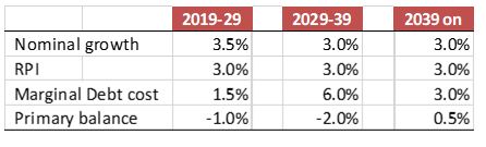
To illustrate this let’s consider a (relatively bleak) scenario for the UK (table 2.1) over the next fifty years. In the first decade we model bond yields at levels not too distant to where they are today, sluggish nominal GDP growth, and a primary deficit (government budget balance before interest costs) of 1.5% of GDP. This scenario is consistent with a stable debt stock as a percentage of GDP, and gradually falling debt service costs.

From 2029-2039 we model a shock to bond yields, rising dramatically to 6%, nominal growth slowing to an even more derisory 3% per annum, and a larger primary deficit of 2% of GDP per annum. From 2039 onwards, we model a combination of continued derisory nominal GDP growth, a fiscal tightening such that the government runs a small primary surplus, and a fall in bond yields to 3%. The Retail Price Index (to which current inflation linked Gilts are indexed) is modeled to stay steady at a growth rate of 3% per annum.

Table 2.1: scenario to illustrate the implications of financing term

table 2

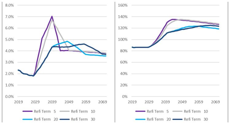
Figures 2.3 and 2.4 show how the modeled scenario can have quite differing implications for both the fiscal cost of debt service and for the contemporary stock of debt as a percentage of GDP. The purple line assumes that primary deficits and refinancing needs are met exclusively through the issuance of new five-year bonds at the modeled marginal bond yield (which is assumed to be stable across all maturities). This choice of tenor sees interest costs rise rapidly to 7% of GDP between 2029 and 2039 before receding even more rapidly to 4% over the subsequent five years. Debt to GDP rises from 2029 until 2044 when it reaches 135% before beginning a glacial decent, reaching 127% by 2071. The grey line illustrates the impact using the same assumptions but this time assuming that financing needs are met through the exclusive issuance of ten-year bonds. The light blue line shows the impact of issuing exclusively twenty-year bonds and the dark blue the impact of issuing exclusively thirty-year bonds.

Figures 2.3 and 2.4: Interest as a % of GDP; debt as % of GDP

Fig 5-6

Concerns that a fiscal rule associated with the fiscal costs of debt service rather than debt stock might put the government at the mercy of markets capture a truth that governments’ fiscal costs of debt are determined in part by market yields.

But every government seeking to finance its expenditures through the bond market will already be sensitive to market yields; the degree to which governments have heightened or dampened sensitivity to market movements is very much in their control of their debt management functions. Shifting to a fiscal rule that focused on debt service would put the question as to how much sensitivity the government wanted to have to market rates firmly in the hands of the hands of the government.

References:

Blanchard, O. 2019. ‘Public Debt and Low Interest Rates’. American Economic Review 109, no. 4: 1197–1229 https://www.aeaweb.org/aea/2019conference/program/pdf/14020_paper_etZgfbDr.pdf

Blanchard, O & Leigh, D. 2013. ‘Growth Forecast Errors and Fiscal Multipliers’, IMF Working Paper No 13/1 https://www.imf.org/~/media/Websites/IMF/imported-full-text-pdf/external/pubs/ft/wp/2013/_wp1301.ashx

Blanchard, O. & Tashiro, T. 2019. ‘Fiscal Policy Options for Japan’, PIIE Policy Brief 19-7, May 2019. https://piie.com/system/files/documents/pb19-7.pdf

Borensztein, E. & Panizza, U. 2008. ‘The Costs of Sovereign Default’, IMF Working Paper 08/238, 2008. https://www.imf.org/~/media/Websites/IMF/imported-full-text-pdf/external/pubs/ft/wp/2008/_wp08238.ashx

Broadbent, B. 2014. ‘Monetary policy, asset prices and distribution’, speech given a the Society of Business Economists Annual Conference, October 23. https://www.bankofengland.co.uk/-/media/boe/files/speech/2014/monetary-policy-asset-prices-and-distribution

Debrun, X. & Kumar, M. S. 2007. ‘Fiscal Rules, Fiscal Councils and All That: Commitment Devices, Signalling Tools or Smokescreens?’ in: Banca d’Italia (eds.) Fiscal Policy: Current Issues and Challenges, Papers presented at the Banca d’Italia workshop held in Perugia, 29–31 March 2007, pp. 479–512. https://www.bancaditalia.it/pubblicazioni/altri-atti-convegni/2007-fiscal-policy/Debrun_Kumar.pdf?language_id=1

Fischer, S. 1996. ‘Why are Central Banks Pursuing Long-Run Price Stability?’ Jackson Hole Symposium, August. https://www.kansascityfed.org/publicat/sympos/1996/pdf/s96fisch.pdf

HM Treasury, 2017. Charter for Budget Responsibility: autumn 2016 update. January. https://assets.publishing.service.gov.uk/government/uploads/system/uploads/attachment_data/file/583547/charter_for_budget_responsibility_autumn_2016_update_final_for_laying_web.pdf

Hughes, R., Leslie, J. & Pacitti, C., 2019. ‘Britannia waives the rules?’, Resolution Foundation, October. https://www.resolutionfoundation.org/app/uploads/2019/10/Britannia-waives-the-rules.pdf

IMF, 2002. Assessing Sustainability, May. https://www.imf.org/external/np/pdr/sus/2002/eng/052802.pdf

IMF, 2009. ‘Fiscal Rules – Anchoring Expectations for Sustainable Public Finances’, Fiscal Affairs Department, December http://www.imf.org/~/media/Websites/IMF/Imported/external/np/pp/eng/2009/_121609pdf.ashx

IMF Fiscal Rules Dataset, 1985-2015. http://www.imf.org/external/datamapper/fiscalrules/map/map.htm

Lledó, V., Sungwook, Y., Fang, X., Mbaye, S, Kim, Y. 2017. ‘Fiscal rules at a glance’, International Monetary Fund, Washington DC, March. https://www.imf.org/external/datamapper/fiscalrules/Fiscal%20Rules%20at%20a%20Glance%20-%20Background%20Paper.pdf

Mauro, P. (ed). 2011. Chipping Away at Public Debt: Sources of failure and Keys to Success in Fiscal Adjustment, John Wiley & Sons.

Mauro, P., Romeu, R., Binder, A., & Zaman, A. 2013. ‘A Modern History of Fiscal Prudence and Profligacy’, IMF Working Paper No. 13/5, International Monetary Fund, Washington, DC https://www.imf.org/external/pubs/ft/wp/2013/wp1305.pdf

Portes, J. & Wren-Lewis, S., 2014. ‘Issues in the Design of Fiscal Policy Rules’, Department of Economics Discussion Paper Series No.704. May. https://www.economics.ox.ac.uk/materials/papers/13342/paper704.pdf

Rogoff, K. 1987. ‘Equilibrium Political Budget Cycles’, NBER Working Paper 2428. http://www.nber.org/papers/w2428.pdf

Romer, C. D., & Romer, D.H. 2019. ‘Fiscal space and the aftermath of financial crises: how it matters and why’, Brookings Papers on Economic Activity, BPEA Conference Draft’, March 7-8. https://www.brookings.edu/wp-content/uploads/2019/03/Fiscal-Space-and-the-Aftermath-of-Financial-Crises.pdf

Summers, L.H. 2014. ‘US economic prospects: secular stagnation, hysteresis and the zero lower bound’, Business Economics Vol 49, No2. National Association for Business Economics. http://larrysummers.com/wp-content/uploads/2014/06/NABE-speech-Lawrence-H.-Summers1.pdf

[1] See for example Borensztein. & Panizza. (2008), Fischer (1996).

[2] See IMF (2002) on the degree to which fiscal sustainability can be understood as a political concept.

[3] While the limiting factor on private sector or foreign-currency-denominated sovereign indebtedness is creditworthiness, the degradation of which can be observed in financial instability, the limiting factor on monetary sovereign debt and deficits is the acceptability of the currency, the degradation of which is manifest in monetary instability – via currency weakness, inflation, and/ or a fracturing of the financial system.

[4] These are the so-called ‘shortsightedness’ and ‘common pool’ problems. For shortsightedness see Rogoff (1990); for ‘common pool problem’ see Debrun and Kumar (2007).

[5] Debrun and Kumar (2007), IMF (2009).

[6] See IMF Fiscal Rules Dataset (2016) for a catalogue of past and present fiscal rules at the national and supranational level, and Lledó, et al (2017) for a history of fiscal rules by country.

[7] Sovereign debt markets exist not only to finance government deficits (or rather sterilise the monetary impact of fiscal payments in excess of tax receipts), but also to provide funding benchmarks for private bond issuers, and to serve as high quality collateral for the domestic financial system. Sovereigns not requiring external financing have issued full yield curves of benchmark securities for these reasons.

[8] Blanchard & Leigh (2013).

[9] Romer & Romer (2019) examine the motivations attached to large and small-scale episodes of austerity across the OECD since 1990 and find instances where the communicated rationale for pro-cyclical austerity was misplaced fear of loss of market access.

[10] This criticism is certainly not universal, with Wren-Lewis and Portes (2017) and Hughes, Leslie & Pacitti (2019) notable attempts to incorporate monetary constraints to a fiscal rule. Towards the end of 2019 the Conservative Party announced that the UK’s fiscal framework (requiring a cyclically-adjusted deficit below 2% by 2020-21 and the delivery of a reduction in the net debt to GDP ratio each year unless the Treasury judges that there has been a ‘significant negative economic shock to the UK economy’ (HM Treasury 2017)) would be replaced by a requirement to run a balanced current budget excluding capital expenditure from 2022, a 3% of GDP limit to net investment and a 6% of tax revenues maximum for debt interest costs, beyond which government must reassess its borrowing plans with the goal of stabilizing debt stock. While a step in the right direction, this approach retains the asymmetry of previous fiscal rules.

[11] A simple shorthand for estimating the change in debt as a percentage of GDP is the equation: , where r and g represent the interest rate and growth rate respectively (in either real or nominal terms), while d and p represent the stock of debt and primary surplus (each as a proportion of GDP). Setting Δd to zero delivers a framework for achieving a stable debt to GDP ratio. Simply put, a higher rate of economic growth, a lower interest rate, and a higher primary budget surplus are all things that help to reduce debt stock.

[12] See Mauro (2012).

[13] There is a further question as to whether a symmetric fiscal rule should be set to target interest costs net of the Bank of England’s Asset Purchase Facility (APF) payments. Doing so would turbo-charge monetary-fiscal coordination by delivering to the Bank of England a mechanism to provide direct and immediate fiscal space that must be deployed by the Treasury if the lower bound of interest costs as a percentage of GDP was not to be breached. This is because coupons paid on the gilts held in the APF by the Treasury are returns to the Treasury (minus financing costs) , and as such quantitative easing: a) delivers real fiscal dividends in the form of a lower net interest cost; b) could require the Treasury to ramp up debt issuance such that the minimum debt interest payment rule was met. The degree to which such levels of coordination would threaten the Bank’s independence and institutional credibility need though to be considered in weighing this option, as would the costs of unwind.

How equal could UK property wealth be, given the current physical stock?

When trying to estimate inequality in Britain, it sort of depends what you’re looking at.

While UK income inequality rose significantly in the 1980s, it has stayed pretty steady since the early 1990s. Wealth inequality is greater by an order of magnitude, and wealth in the UK means private pension wealth (42% of household wealth) and property (35% wealth), with physical and financial wealth making up the other 24%. I have blogged before about wealth taxes, which I think are a good idea in principle. They may even feature as a key issue in the US Presidential election, depending on who gets the Democratic nomination. But it seems likely that the topic of wealth taxation will be off the agenda for some time in the UK.

The ONS calculates splits UK wealth inequality (with a Gini coefficient^ of 0.63) into net financial wealth (0.91), private pension wealth (0.72), and net property wealth (0.66). I’m guessing that with each of these having a higher Gini than the Gini for total wealth, some households have more pension but less property, some less property and more financial wealth etc.

Gini coefficients for UK wealth and income

gini1

The biggest driver of private pension wealth is whether you are in a pension scheme at all. Only 53% of individuals (aged 16-State Pension age) are in an active scheme, and this is after the +10% bump up that came from auto-enrollment .

If you are in a scheme, the biggest driver of your pension wealth is whether you are in a Defined Benefit scheme or a Defined Contribution scheme. I wrote a thread on the latest data here , and leave you with this cool ONS chart from the threads that shows pension wealth by age and scheme type. This is a big deal, and I would expect it to become an increasingly big deal.

db dc

But, as Arlo Guthrie said, that’s not what I’m here to tell you about. I’m here to talk about property inequality. Or rather, I want to know what level of wealth inequality is embedded in the physical stock of UK property wealth.

The seed of this question grew in the run-up to the General Election. Basically. if you’re going to apply wealth taxes to property (as an asset that can’t flee the country), then given my assumption that wealth inequality is way higher than income inequality (see first chart above), doesn’t this mean that people with top-quartile incomes aren’t going to be able to afford to live in their homes? (Yes, I know, tiny violin time.)

In order to make some headway I asked @resi_analyst for advice, and he kindly pointed me to annual transaction data files. With around 4-5% of residential properties changing hands each year it is maybe not a stretch to infer that they are a reasonable sample of the UK residential stock. I like this a lot more than looking at the (excellent) ONS Wealth & Assets Survey data because the WAS is a survey, while transactions represent a much bigger dataset.

And this is what I found, looking at easily-available from the last six years. The chart is log-scaled and shows the proportion of properties sold by price-point. So in the first 10 months of 2019 the median residential property transaction value was £235k. A quarter of properties changed hands for £355k or more, and 1% of properties changed hands for £1.26m or more. The stuff in the very top one percent is a bit whacky, and is driven by a very small number of super-high property transactions.

UK residential transactions by percentile price point, 2013-Oct 2019

dist1

This top-tail is interesting, but very small. I could imagine some of these being split up into flats (although a fair few are Belgravia flats already), and as such the structure of inequality in the property stock could be amended pretty easily. This would all require building work to do and my question is around the physical stock as it stands today.

If we remove the top-priced property from the distribution and examine only the bottom 99% on transaction values, things look a bit different (still requiring a log-scale, mind).

dist2

I applied a bit of VBA code kindly left hereto then calculate the Gini coefficients of the transaction values.

I was quite surprised by what I found.

Firstly, in contrast to the net property wealth data from the ONS, the level of inequality embedded in the value of physical private residential stock is actually not too far away from the level of income inequality in the UK. Taking out the top and bottom percentile of transactions (of course) makes this even more the case:

gini2

Secondly, if we were to take transaction values as a good proxy for the value of the stock, we have seen an increasing convergence between income inequality (dark blue line) and the embedded inequality attached to the physical stock of UK residential property (red line). Moreover, this isn’t a function of those whacky idiosyncrasies at the very top of the distribution of property transactions. We can see this to be true by looking at the Gini coefficient of the 1-99%ile of transaction values (light blue line).

gini3

The data exists to calculate this going back to 1995, but sadly the ONS data file is too monstrous for me to deal with in simple Excel.

Why is my estimate of the stock of private property stock value inequality so different from the net property wealth measure of inequality from the ONS?

  • Firstly, the whole point of my inquiry was to see how equal property wealth could be, given the current physical stock of property that is in place today. This is very different to measuring the current level of inequality that resides in property assets.
  • Secondly, the ONS net property wealth is calculated by netting mortgage debts off against the value of residential property owned. So If I buy a house for £235k with a mortgage of £200k, my net property wealth is £35k. That’s what net means. I care about the £235k while the ONS cares about the £35k.
  • Third, there are only 20m private sector residential dwellings (out of a total 24.2m dwellings), and I am looking at value-inequality within this dataset. The ONS reckons that there are 27.6m households. It’s not immediately clear to me how households are defined, as they appear to be defined in a way that is detached from homes. Regardless of this quirk, we know that there are a *lot* of households who don’t own.
  • Lastly, there are lots of wild assumptions in my data: that transactions are a decent proxy for the evolution of stock values; that things observed in England & Wales are true for the UK as a whole; that excluding BTL and offshore purchases doesn’t screw things up. Each of these could be wrong.


Maybe I shouldn’t have been so surprised. Somewhere between ‘a lot’ and ‘almost all of’ the value of a residential property is tied up in its locational value, and this locational value is significantly a function of the proximity to cash flows that flow from employment. If high paying employers set up in a given locality it’s going to boost the locational value of the area. Simples.


^ To quote George Banham of the Resolution Foundation, the Gini coefficient measures inequality on a scale from 0 to 1, where 0 is perfect equality and 1 is perfect inequality (a situation where one person has all the wealth).